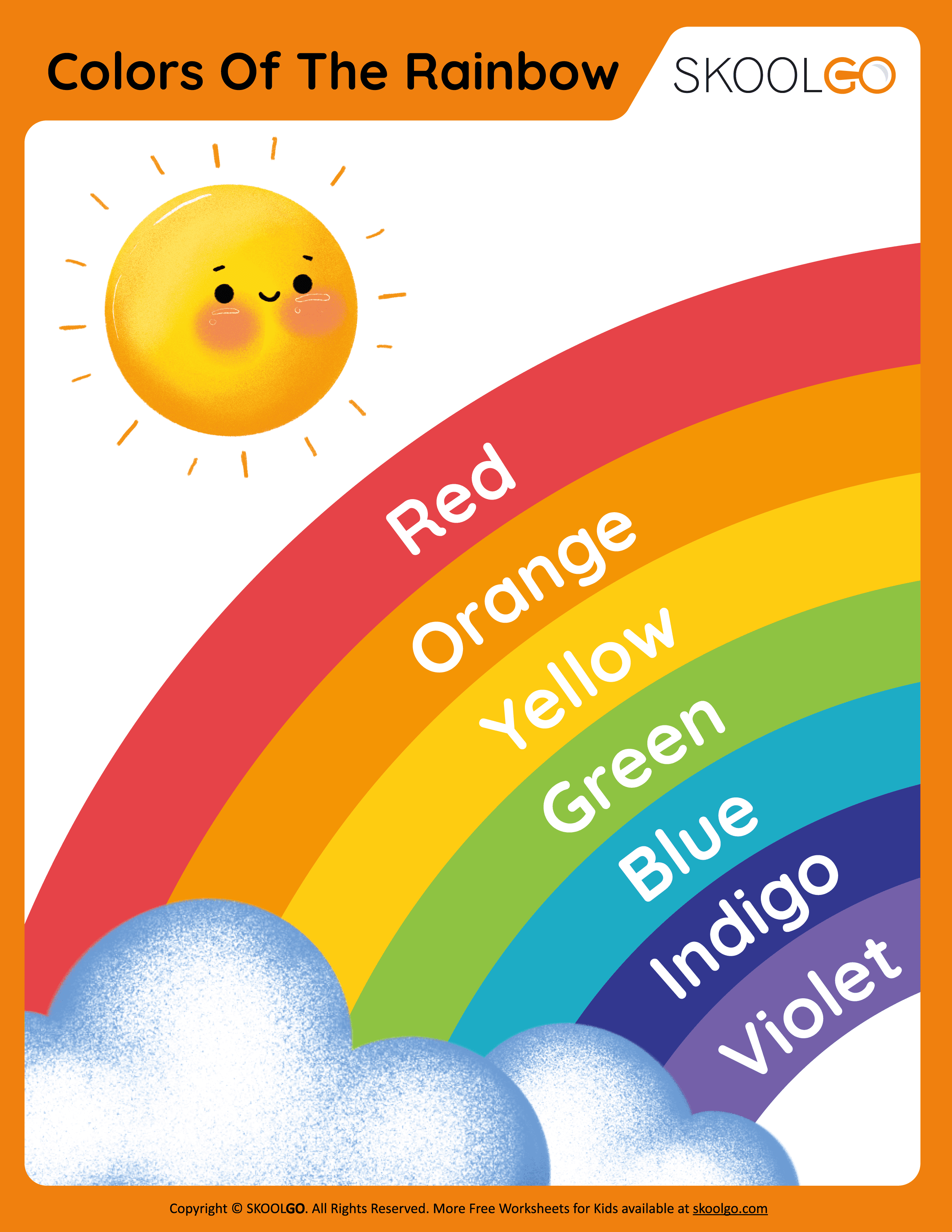
Have you ever wondered why the colors of a rainbow always appear in the same sequence? The natural phenomenon of light dispersion creates a mesmerizing display that follows a precise pattern. ROYGBIV, an acronym representing Red, Orange, Yellow, Green, Blue, Indigo, and Violet, is not just a random sequence but a scientifically grounded order based on wavelengths. This article delves into the intricacies of organizing objects by these vibrant hues, focusing specifically on how to create a visually appealing rainbow-colored bookshelf.
The concept of arranging items by color has gained popularity over the years as both a functional and aesthetic practice. For instance, books can be organized in various ways—alphabetically, by genre, or by size—but none evoke the same charm as a shelf arranged in the iconic ROYGBIV spectrum. When sunlight passes through water droplets after rainfall, it refracts and separates into distinct bands of color. Similarly, when organizing your book collection, adhering to this natural sequence ensures harmony and balance within your space. Understanding the principles behind this arrangement helps transform everyday objects into works of art.
| Color | Wavelength Range (nm) | Symbolic Meaning | Reference Link |
|---|---|---|---|
| Red | 620–750 | Energy, passion, vitality | Learn More |
| Orange | 590–620 | Creativity, warmth, enthusiasm | Learn More |
| Yellow | 570–590 | Happiness, optimism, intellect | Learn More |
| Green | 495–570 | Growth, harmony, renewal | Learn More |
| Blue | 450–495 | Calmness, trust, stability | Learn More |
| Indigo | 430–450 | Spirituality, intuition, wisdom | Learn More |
| Violet | 380–430 | Creativity, luxury, ambition | Learn More |
Creating a rainbow-colored bookshelf involves more than simply placing books side by side; it requires attention to detail and an understanding of color theory. Begin by sorting your books according to their spine colors. Group similar shades together before transitioning smoothly from one hue to the next. Start with red at one end of the shelf and progress through orange, yellow, green, blue, indigo, ending with violet. This method ensures that each transition appears seamless, mimicking the gradient effect seen in nature.
While some may argue that strict adherence to ROYGBIV limits creativity, others find beauty in its predictability. Sir Isaac Newton's discovery of the seven-color spectrum laid the foundation for modern optics. He demonstrated that white light could be split into individual components using a prism, revealing the true nature of visible light. His work remains relevant today, influencing everything from interior design trends to digital displays.
Incorporating rainbow-themed arrangements extends beyond personal spaces like home libraries. Educational institutions often use such visuals to teach children about science and art simultaneously. Teachers frequently employ colorful charts and diagrams to explain complex concepts related to light refraction and wavelength properties. By associating specific emotions or ideas with each color, educators help students develop a deeper appreciation for the world around them.
For those who enjoy crafting, creating a rainbow-ordered palette offers endless possibilities. Stampin' Up!, a well-known brand specializing in paper crafting supplies, provides users with tools to experiment with different shades while maintaining consistency across projects. Their product range includes ink pads, cardstock, and embellishments designed to complement any artistic endeavor. Users are encouraged to personalize their selections based on individual preferences, ensuring no two creations look exactly alike.
Beyond aesthetics, there exists symbolic significance attached to each color in the ROYGBIV sequence. Red symbolizes energy and passion, making it ideal for starting points or focal areas. Orange conveys creativity and warmth, often used to stimulate conversation and interaction. Yellow represents happiness and intellect, promoting positivity and mental clarity. Green embodies growth and renewal, fostering connections with nature and sustainability efforts. Blue signifies calmness and trust, providing relief during stressful periods. Indigo reflects spirituality and intuition, encouraging introspection and self-discovery. Lastly, violet combines creativity with luxury, inspiring innovation and ambition.
Practical applications of rainbow color schemes extend into professional settings as well. Corporate branding strategies frequently incorporate multiple hues to convey diverse messages depending on target audiences. Marketing campaigns utilize contrasting yet complementary colors to capture attention and enhance memorability. Interior designers rely heavily on color psychology when planning commercial spaces, ensuring environments align with intended purposes.
As technology advances, so too does our ability to manipulate light and color digitally. Modern screens replicate the full spectrum of visible light, allowing viewers to experience virtual rainbows with remarkable accuracy. Software developers continue refining algorithms capable of reproducing authentic gradients, further bridging gaps between physical and digital worlds.
Despite centuries of study, much remains unknown regarding human perception of color. Cultural differences influence interpretations of certain hues, leading to varied associations worldwide. While Western societies associate red with love and celebration, Eastern cultures view it as auspicious and prosperous. Such nuances highlight the complexity inherent in studying something seemingly straightforward yet profoundly intricate.
Ultimately, embracing the natural order of rainbow colors enriches daily life in countless ways. Whether designing living spaces, teaching scientific principles, or pursuing creative hobbies, following established guidelines enhances outcomes while preserving originality. Next time you encounter a real-life rainbow, take a moment to appreciate its beauty—and perhaps draw inspiration for your next project!